Sunday, January 29, 2017

LumaCon 3, Supervillains 0

The joke in that title never gets old. To me.

Local librarians threw the third annual LumaCon in the city of Petaluma, Calif. last Saturday. If LumaCon had a mission statement, it'd include bringing students interested in writing, art, and comics together with amateur and professional practitioners to talk shop. It's small (attendance about 2500), free, low-key, down-home, and about as charming as could be. I even sold a few books. It's my absolute favorite comics convention.

The people who organize LumaCon do it for the love of kids and comics. They treat their guests better than any convention I know of, providing a gift basket, a lounge generously stocked with snacks, and trusted sitters who are happy to watch your table while you meander or take a break. That last is a practical, generous service that other cons could emulate.

I love talking with kids who want to make comics. This year I noticed more shy ones than in the past. They'd come up to the table, silent and staring, with a parent who talked about how much their son or daughter loved to draw pictures and make up stories. A nice way to open them up a bit was to show some of my original drawings and then show them how those drawings look as published in one of my books. I remember being young and not knowing, for example, that most comic art is drawn larger than it appears in print. I tried to demystify the process a bit. Making comics is work, but it's not magic. A few kids really seemed to get that. Some maybe went home excited to try it themselves.

As I understand it, that's one of the points of LumaCon, which distinguishes it from all other cons I've attended.

My daughters came and hung out with me for most of the day, but I'm forbidden to post photographic proof. However, I did try to get around and take some pictures.

LumaCon is held in a local community center. This is how you know you've found the right place.

High school librarian Nathan Libecap, one of the head organizers, infused with as much energy and passion as if he'd been bitten by a radioactive spider. I don't get a lot of opportunities to wear that shirt.

I was seated next to my friend Jason Whiton, who hosts SpyVibe and has a terrific interest in, and knowledge of, mid-century mod/pop culture: The Prisoner, The Man from UNCLE, Dr. Who, cartoonist Mort Walker, and more. He's also a teacher. We talked all day. The Robot is a papercraft doll I engineered for my "Last Mechanical Monster" webcomic, intended as a sort of thank you prize for readers who made it to the end. I handed out little cards with a URL to the plans for anyone who wanted to try building it themselves. Give it a shot if you want

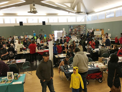
Two angles on the main Artists' Room, above and below, taken from a stage. Cartoonists Lex Fajardo and Paige Braddock are in the foreground of the photo above.


Turned around to get a picture of the Arts & Crafts action on that stage. Good creative energy. All day I saw kids running around with cardboard Captain America-style shields they'd made.
Vendors and booksellers crowded the entrance lobby.

The bake sale. How can you not love a convention that has a bake sale?

One of the highlights of my day was sitting across from, and getting to talk with, Izzy Ehnes. She does single-panel cartoons with a smart and dark POV. Fair or not, the best comparable I can think of is "The Far Side." Two years ago Izzy attended the first LumaCon, where her work was spotted by cartoonists Stephan Pastis and Nick Galifianakis. Stephan recommended her to Universal-UClick editor John Glynn, which is how her comic The Best Medicine ended up with a worldwide audience on GoComics.com. See? It's just that easy.

I checked in with another talented young woman, my friend Erin, who cartoons under the name Sam Coaass. Erin and her mother showed up at every local comics-related event since she was in middle school, and now she's in community college as determined as ever.  No one can predict success but she has all the tools to achieve it.

Paige Braddock and Art Roche from the Schulz Studio. Paige does a children's series called "Stinky Cecil" as well as decidedly non-children's work like "Jane's World" and "The Martian Confederacy." Art has a new book coming out soon titled "The Knights of Boo'Gar"; I've seen early drafts and think it could do well with fifth graders who like puns about boogers. Which is all of them.

Lex Fajardo had kids and parents surrounding his "Kid Beowulf" booth all day. Long self-published, Kid B. is now being put out by publisher Andrews-McMeel, which has the potential to reach a much larger audience than Lex could on his own. Lex is very thoughtful about comics and works hard. I hope he's got a hit on his hands.

Said hello to Terrific Tom Beland (now I feel like Stan Lee handing out nicknames to the Marvel Bullpen in 1965). Tom has freelanced for Marvel Comics, Image and IDW, did a great book titled "True Story Swear to God," and recently published "Chicacabra." He's got a smooth, elegant, clean inking style I really admire. Beautiful artwork and perceptive writing.

Jason Whiton took this picture of me doing what I described at the start, showing a girl and her father my original drawings and explaining how they got turned into a book. A really sweet kid. That's librarian Nathan Libecap behind. The con staff did a smart thing in that they all wore orange capes, so if you had a problem or needed someone to watch your table for a few minutes, you could just grab an orange cape for help. 
LumaCon had some of the usual costume ("cosplay") fol-de-rol, most of it charmingly homespun.
These Star Wars guys were semi-pros who looked very sharp . . .

. . . but my favorite of the day was the cardboard starship Enterprise. Terrific.

A few "civilian" pals dropped by as well, including my friends Marion and Susan, and three great people I worked with long ago who conspired to gang up and surprise me. They succeeded! Jeran, Kim and Honora all remember when my daughters were born, so it was really special for me to reintroduce them all grown up.

Another nice moment: I was a short distance from my table talking to Tom Beland when I looked over and saw one of my girls urgently waving me back. I hustled over and found them talking with a distinguished older woman with two boys in tow. Turns out she was a very good friend of my mother's 40 years ago who had brought her grandsons to LumaCon, just happened to notice my name on the table, and had been quizzing my daughters with way more information about my family than anyone should rightly have. I remembered her and her husband very well--she was actually one of a few adults who respected my interest in comics when I was a teen--and we had a good time catching up. Another wonderful surprise.

All in all, LumaCon is about as sincere as Linus's pumpkin patch and as easy to love. This seems like an especially good time to promote creativity and literacy. I'll keep going as long as they'll have me.

Sunday, January 15, 2017

How I Made a Picture

I haven't done a "how to" post in a long time, but a few days ago I made a drawing that I was uncharacteristically happy with, and thought it'd be a good example of how I sometimes combine real ink-on-paper art with digital (Photoshop) manipulation to get the result I want.

As always, this isn't the right way or the only way, it's just one way I solved a particular problem. Your mileage may vary.

I think it helps to have some sort of Philosophy of Art, even if you don't call it that--some sense of how you like to do things. A Platonic Ideal. For example, my ideal comic would be one that's entirely hand drawn, hand lettered, and even hand colored right on the page. A comic crafted like that has integrity.

Now, I don't ever do that. For production and printing purposes, I letter and color in Photoshop. But I know some people who do, such as the great Carol Tyler. What you see in her books is exactly what she puts on the paper. I admire and envy that authenticity, and consider everything I do that isn't that a compromise that comes with a cost.

Your goal guides your process. I think Art should be as organic and analog as possible. Other artists have different philosophies. Many don't hesitate to do as much digital work as they can, up to 100 percent. I won't argue. It can look terrific. Whatever works. As the great cartoonist Wally Wood said:

Never draw what you can swipe.
Never swipe what you can trace.
Never trace what you can cut out and paste.
And never do any of that if you can hire somebody to do it for you.

One reason I'm happy with this drawing, which is for a future project I won't talk about that's set to follow another project I won't talk about, is that it took me several tries to crack it. I couldn't figure out my composition and point of view. Here's what I came up with:


Based on photos of a real place, it's a black-and-white two-page spread that'll be printed with the left half on one page and the right half on the facing page. I'm happy with it because the left page draws your eye to the word balloon and car, the right page draws your eye to its destination--the steps and doors behind the flagpole--and together they make an asymmetrical but balanced (I think) composition.

I did not want to spend two weeks drawing that. So I cheated.

First I drew this. You can see some of my blue penciling under my black ink lines:


Yeah, I drew all those rocks by hand; I'm not completely lazy. I also drew this:


Those four rectangles at the top of the drawing became groups of three or four windows of various widths and heights simply by squashing or stretching them in Photoshop:


Copy and paste and paste and paste and paste and paste:


Copy and paste that whole thing five times and BOOM, instant sprawling compound.

I drew the car separately because I don't like to draw cars:


One thing I kept in mind when drawing the car, and throughout the entire assembly, was keeping line weight consistent for the final drawing. I drew the car with a thicker line and less detail than I otherwise might have because I knew it would end up very small, and it still had to look like it belonged in the rest of the picture.

I didn't draw all the trees. I actually really love inking pine trees with a brush--it's meditative--but not that many. Instead, I drew 20 trees and clumps of trees, then manipulated them to look like more. Copy and paste those variations, trying not to put two duplicates next to each other, and you've got a forest.

The top row are the only trees I actually drew. The rest I tweaked in Photoshop.

So here are the buildings and car pieced together, followed by the trees on a separate Photoshop layer (think of it as a transparency), which makes it a lot easier to color the ground "behind" them:


Put 'em all together, add some grays and words, and easy-peasy.


I don't expect to rely on so much digital tomfoolery for the rest of the project. I still aim to render as much by hand as possible. But because this two-page spread is an important establishing shot that shows the reader where they are and sets the stage for the entire story, I needed this level of detail and grand scale. After laying that foundation, I can relax a bit.

Maybe someone else could do a drawing like that completely freehand but I can't, at least in the time I had to spend on it. So I did what works, with no apologies. It looks exactly like I wanted it to. That's the goal that guided my process.